
 Good work.


Hand your phone to someone who doesn’t know your business. Open your homepage. Then say, “Tell me what you think I do.”
Now comes the difficult bit: don’t help.
No pointing at the menu. No explaining that the photo is actually one of your jobs. Let the page do the talking, and see what they make of it.
If I were sitting beside you with your homepage open, this is where I’d start. We can talk about the logo and button colors later. First, I want to know whether the page gives a new customer a clear way in.
I used to work with million-dollar marketers. Now I bring that experience to small-business websites. One question carries over: have we given this person enough reason to take the next step? A plumber’s customer and a bookkeeper’s customer need different answers. Both need to understand the offer.
So here’s a small exercise you can do without buying anything: ask someone who doesn’t know your business to look at your homepage. Give them these five questions. Then resist the urge to explain the whole thing.
Yes, that last part is the hard part.
1. What do you do?
Cover the logo for a moment. Can you still tell what the business sells?
A headline like “Elevate your tomorrow” sounds impressive until you ask what you’re supposed to buy. Accounting? Patio furniture? A hot-air balloon?
I’d rather see a plain sentence that helps the right customer settle in. For a bookkeeper, that might be:
Bookkeeping for busy contractors who want their evenings back.
Monthly bookkeeping and clear financial reports for construction businesses.
The first line gives the visitor a reason to care. The second tells them what you actually do. You can add your personality without making the service a guessing game.
Here’s a made-up house-washing example. Same business, much clearer introduction:
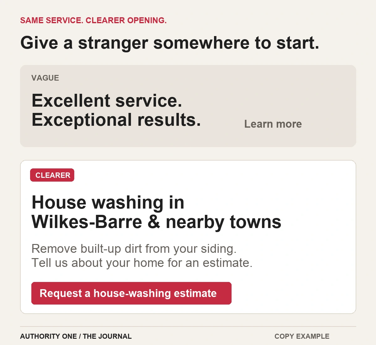
Notice what I haven’t squeezed into that opening: every service, the full company history, and six reasons we’re passionate about excellence. Those can wait. The visitor needs somewhere to start.
Try this: ask your tester, “What do you think this business does?” Write down their answer exactly. If they describe a different service, or answer with “something to do with…,” look at your headline and the sentence below it first.
2. Is this for someone like me?
People can understand your service and still wonder whether they belong here.
Take a dog groomer. “Professional pet grooming” tells me the category. It doesn’t tell me whether you handle my elderly dog, large breeds, or a nervous first visit. Those are the details a real owner may be looking for.
If those services are part of your business, make them easy to spot. Use a short service list, a useful FAQ, or photos of the kinds of pets you actually groom. You don’t have to turn the headline into a breed directory.
Location needs the same care. A roofer should make their real service area clear. A bookkeeper who works remotely should say so, rather than making people assume they must live nearby.
The question to ask: “Who do you think this business helps?” If the person you want as a customer can’t see themselves in the answer, add the missing detail.
3. Why should I trust you?
“Reliable. Professional. Committed to quality.”
I don’t object to any of those qualities. I just need something to back them up. Your competitor can type the same three words before the coffee finishes brewing.
For a landscaper, that could mean real photos of a finished patio, with a short note about the job: what the homeowner wanted and what the team built. For an accountant, it might be the person’s name, relevant qualifications, and a clear explanation of the services they provide.
A customer’s own words can help too. Pick a genuine review that answers a useful concern: communication, showing up, explaining the work, or leaving the property tidy. Keep the meaning and attribution intact. Don’t turn a kind comment into a claim the customer never made.
I’d also look at what happens between the inquiry and the finished job. An owner may trust your work but still dread the process. A few lines explaining how estimates, appointments, or project updates work can take some of the mystery out of contacting you.
On my own site, I explain my marketing background and let visitors hear from people I’ve worked with. You can see those client stories here. That’s more useful than asking you to take “great service” on faith.
Ask your tester: “What, if anything, makes you feel comfortable contacting this business?” If they point to nothing, put one solid piece of proof nearer the service or button it supports.
4. What do I do next?
A visitor shouldn’t have to solve the page before they can contact you.
Suppose I need an electrician to install a ceiling fan. A button that says “Explore” makes me wonder whether I’m about to open a service page, a photo gallery, or a form. “Request an installation estimate” gives me a much better idea.
The destination has to match. If I’m only sending a request, don’t label the button “Book my appointment.” I haven’t booked anything yet.
Nielsen Norman Group’s research on link labels makes the same point: useful labels tell people what to expect, and the next screen should fulfill that expectation.
Choose a main next step for the page. You can still have a menu, a phone number, and useful links. Give the action you most want visitors to take a clear place and label. For an emergency service, calling may matter most. For a planned project, an estimate request may make more sense.
Then follow that click all the way through:
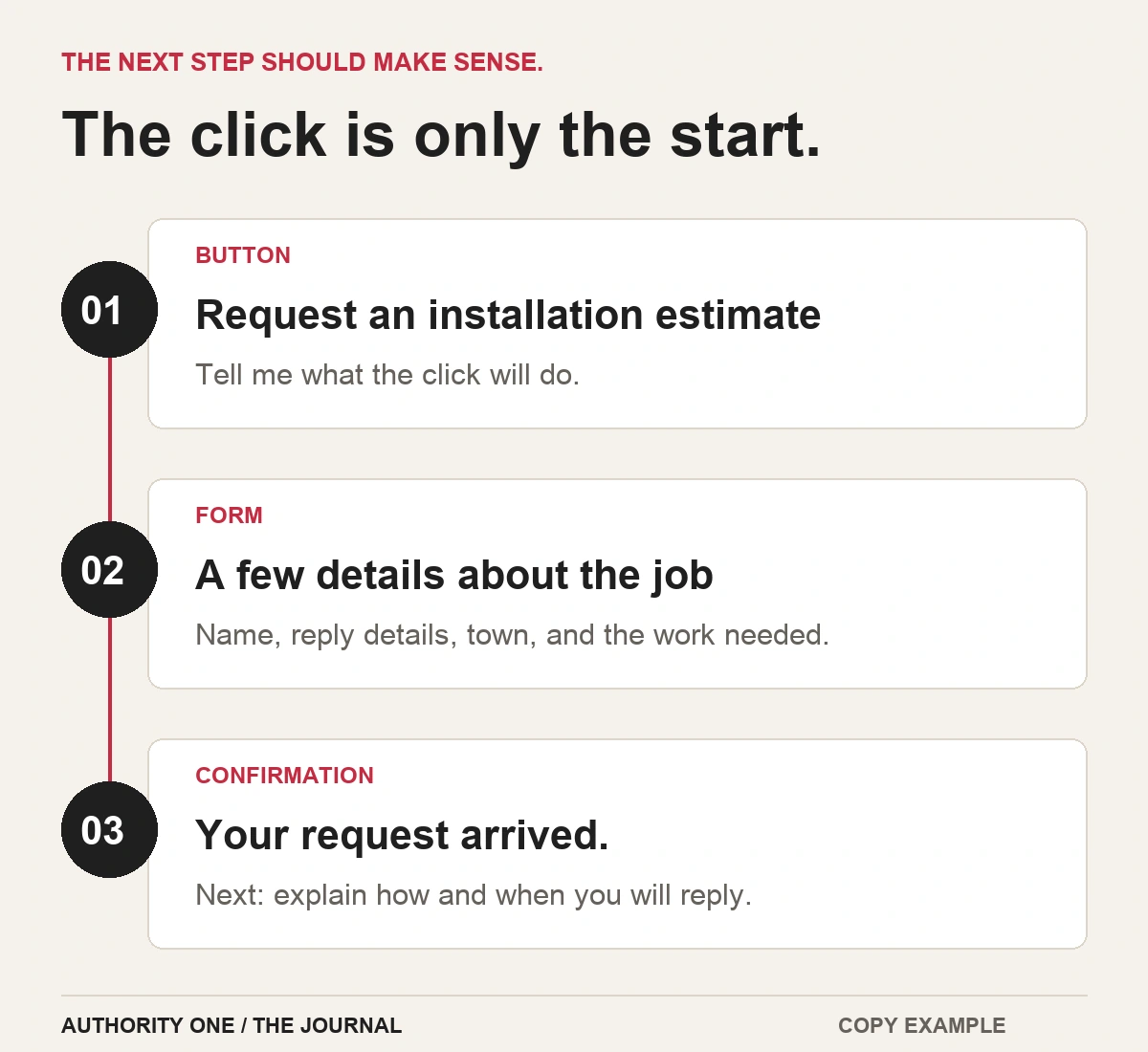
A request form might need a name, a way to reply, the town, and a short description of the job. Ask for whatever you truly need to start. Save questions that belong in the later conversation for later.
And please give the thank-you page a job. “Thanks!” is polite, but it leaves me wondering whether my message worked. Confirm the request arrived, tell me what happens next, and say how to contact you if I need to add something. If there’s a helpful preparation guide, this can be a good place for it.
If you want to go further with email follow-up, my FluentCRM review explains the tool I use on this WordPress site. The software helps you deliver the message; you still need to decide what would be useful to send.
Give your tester a task: “You want an estimate for a ceiling-fan installation. Show me how you’d ask for one.” Watch where they go. Don’t tell them which button to use.
5. Can I do it on my phone?
Pick up your actual phone for this one. A page shrinking nicely in a desktop preview is a good start. Your fingers still get a vote.
Imagine a homeowner checking your roofing website while looking at a leak. Can they read the service area, find the contact option, and use it without zooming or closing three things?
Try the whole path:
- Read the opening without pinching the screen.
- Open the menu and close it again.
- Tap the main button with your thumb.
- Fill out the form with the keyboard open. Check that labels and errors are readable.
- Look for anything covering the next step: a chat window, cookie notice, or popup.
- Reach the confirmation and check that it makes sense.
For your own test, use clearly marked test details and let whoever receives the requests know what you’re doing. A test should not leave your team chasing a mystery customer.
If you build with Elementor, I cover its mobile editing controls in my Elementor review. They help you adjust the layout. You still need to try the finished page on a phone.
How to get an honest answer
“Do you like my website?” is tempting. It also makes it very easy for someone to say yes and get back to their day.
Choose someone who could plausibly use your service, but hasn’t already learned your business from you. Give them a real situation, such as needing a quote or checking whether you handle their type of work. Ask them to say what they’re thinking as they look around.
Then listen. When they pause, a neutral “What are you looking for?” can help. “The contact button is right there” helps them finish, but hides the problem you came to find.
This is a small version of thinking-aloud usability testing. The GOV.UK testing guide also recommends realistic tasks, neutral instructions, and giving people room to work things out.
Keep a simple note with three columns: question / what they said or did / change to try. “Button unclear” is a useful note. “They didn’t like it” gives you much less to work with.
Start with the confusion that stops someone moving forward. Change it, then try the page with another fresh pair of eyes. You’re looking for clearer understanding and an easier next step. Actual inquiries and bookings are something to watch over time.
You don’t have to rebuild everything today
Sometimes the first fix is one sentence. Sometimes it’s a better project photo, a clear service area, or a button that finally says what it does.
If this exercise has given you a few things to work on, try my free 15-Minute Website Lead Checklist. It gives you a practical way to check your message, trust signals, and inquiry path, then decide what to tackle first.
For the bigger picture, read how I bring direct-response thinking to a service-business website. And if you’d rather talk it through, tell me about your business and request a free homepage preview.
Start with the five questions. Find the one your homepage struggles to answer. That’s a useful place to begin.
