
 Good work.


A customer lands on your website. They like the look of it. They scroll a little. Then they leave.
Maybe they weren’t ready. Maybe you weren’t the right fit. But sometimes the website never gave them a good reason to take the next step. It introduced the business, displayed a few services, and politely waited for something to happen.
I want your website to do a little more than stand there looking presentable.
I used to work with million-dollar marketers. Now I work with you. What I bring to a small-business website is that attention to the response: what someone needs to understand, believe, and do before they become a customer.
You can use that thinking in a bookkeeping practice, a grooming salon, a cleaning company, or a one-person service business. You don’t need a giant marketing department. You need a clear offer and a sensible path through the website.
Rather than talk about it in the clouds, let’s look at a real local website. I’ll show you what I’d keep, what I’d change, and why. Then you can steal the thinking for your own business.
First, what does “direct response” mean?
It means giving the right person a good reason to do one clear thing. Then checking whether they do it.
For a service business, that might be asking for a quote, calling about a job, or booking an appointment. Your website helps them understand what you offer, feel comfortable with you, and take that step.
That sounds simple. It is simple. The tricky part is remembering that the person reading your page doesn’t know your business the way you do.
They may be thinking: Can you help with my problem? Do you work near me? What will this cost? Are you going to make this a whole big thing?
Your page needs to answer those questions before they decide it’s easier to try someone else.
Let’s look at a real business near me
Wet Windows Guy offers window washing and exterior cleaning in northeastern Pennsylvania. Its website covers both homes and commercial properties.
This is an independent design study, not a client project. I haven’t worked with the owner or seen their sales numbers. I’m showing a possible new direction, not claiming their current site doesn’t bring in customers.
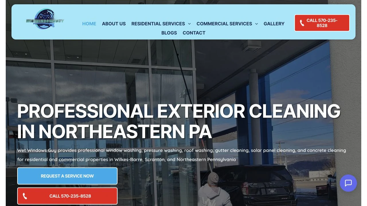
There’s useful material here already. You can see the service area. There’s an easy-to-find phone number. The site has service details and images of work. Those are things I’d build on.
My question is: Could we make the first step feel clearer, warmer, and easier?
Imagine a homeowner looking at spotted windows while comparing a few local companies on their phone. They don’t want to become an expert in cleaning methods. They want to know who can help and how to ask.
That’s the person I’m designing for.
Same business. A clearer reason to reach out.
Here’s the direction I’d explore. I kept the company’s name and used images from its existing website. The new layout and copy are my proposed concept.
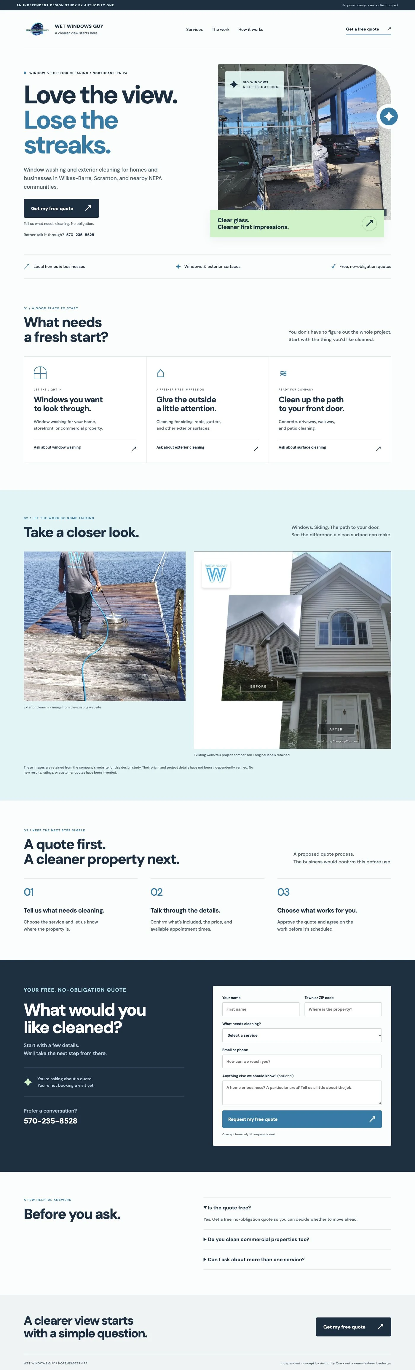
The first thing you notice is the headline. Then the service and area. Then the button. The photo adds a sense of real work being done.
That order is deliberate. I’m trying to help a visitor think, Yes, that’s what I need. Yes, they work near me. Okay, I can ask for a quote.
Now let’s look under the hood. Here’s what changed—and what you can take from it.
Six changes I’d make, with the words I’d use
1. Give the customer something to want
The current headline is “Professional Exterior Cleaning in Northeastern PA.” It does an important job: it tells us the service and the area.
I’d keep that clear information, but let the big headline speak to the customer’s day:
Love the view. Lose the streaks.
A little line above it says what the business does and where. A sentence below explains that it cleans windows and exterior surfaces for local homes and businesses.
The headline gives me a reason to care. The plain details tell me whether I’m in the right place. You need both.
And I’d be careful here: this business offers more than window cleaning. The other services still need clear paths below the opening. If exterior washing is its main source of good jobs, I’d explore a headline built around that instead.
Try this on your own site: What changes for your customer when the job is done? A brighter view? Books they can understand? A dog that feels clean and comfortable? Start there. Then name the actual service and area.
2. Make the button feel like the next small step
The current button says “Request a service now.” That’s an action, but it may leave someone wondering whether they’re booking a visit.
The company already offers free, no-obligation quotes in its website FAQ. I’d bring that offer right up to the first button:
Get my free quote
Tell us what needs cleaning. No obligation.
Now I understand the invitation. I’m asking about a price. I’m not agreeing to a job before I know the details.
I’d keep the phone number close by for people who prefer a conversation. But the quote button would stand out most. Two helpful choices don’t need to fight for attention.
Try this: Read your button out loud. Does it say what I actually get? “Ask about a first grooming visit” is clearer than “Begin your journey.” We’re booking a haircut for a dog, not heading off to find ourselves.
3. Give the page a rhythm people can follow
Design matters here. The new concept uses a big headline, open space, a strong photo, and one clear main button. The softer blue and green areas give your eyes a break as you move down the page.
That’s the flow I want: a useful promise, the services, visible work, a short explanation of what happens, and a place to ask.
The service choices are written around what the customer wants cleaned. A person should be able to spot their need without reading every paragraph.
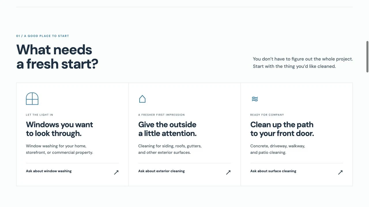
Notice that each card has a clear service description underneath the friendlier headline. Personality is welcome. Confusion isn’t.
This is also where I’d work with the owner. Which services should lead? Which jobs fit best? Where do most customers get stuck? The right order comes from those answers, not from filling a template with whatever fits.
Try this: Take a screenshot of your homepage. Can you point to the first thing a visitor should read? The second? The main button? If everything is equally loud, nothing is leading.
4. Let believable proof do some of the selling
A photo of someone doing the work can say more than a paragraph about excellence. A clear before-and-after can help someone picture the change.
I brought existing images into the concept. For a real project, I’d ask the owner to confirm where each image came from, what it shows, and that we can use it. Then I’d add a short, useful caption.
For example, a caption could name the type of work and the town—if those details are confirmed. A customer review could explain what the visit was like, with permission and without rewriting it into a different claim.
I haven’t added a made-up star rating, a pretend happy customer, or a fake result to this study. Better design should make real strengths easier to see.
Try this: Find one piece of proof for each worry. “Will the work look good?” might need a photo. “Will they be easy to deal with?” might need a real client comment about communication.
5. Explain what happens before asking for the request
People hesitate when the next step is fuzzy. Are you coming over? Calling? Charging them? Asking them to sign something?
I’d propose three simple steps for this page:
- Tell us what needs cleaning. Choose the service and share the property location.
- Talk through the details. Confirm the work, price, and available times.
- Choose what works for you. Agree on the quote before the work is scheduled.
The owner would need to confirm that this matches how the business actually works. If a visit is needed before quoting, say that. If photos would help, explain which ones.
You can answer price questions without putting a pretend price on the page. For window cleaning, I’d ask the owner what affects the quote. Is it the number of windows, access, inside versus outside, or something else? Then I’d explain the real factors in everyday words.
Try this: Finish the sentence, “After you send this form, here’s what happens…” If you can explain it in two or three lines, put those lines near the form.
6. Make the form useful to both of you
I followed the existing request button. It opens a separate form that asks for contact details and the property address. It also tells people when they should hear back. That’s useful information.
For my concept, I explored a smaller first request on the homepage: name, town or ZIP code, the service wanted, a way to reply, and an optional note.
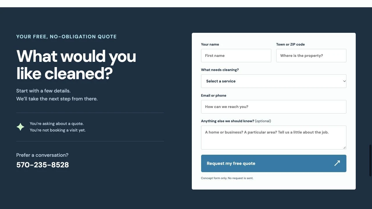
It says: “You’re asking about a quote. You’re not booking a visit yet.” That little sentence takes away a question the visitor may not want to ask.
But fewer boxes aren’t automatically better. If the owner needs the full address to check the area or prepare a quote, I’d keep it. A useful extra question can save a lot of back-and-forth.
Ask what you need to give a helpful reply. Explain anything that might feel personal or unclear. Keep the labels visible while people type; W3C’s form guidance explains why labels matter.
Before changing the form, I’d also check how it connects to the business’s customer system. A lovely new form that loses requests is a very expensive decoration.
Try this: Fill out your own form on your phone. Can you correct a mistake without starting over? Can you read the labels? Does the request arrive where you expect it?
The page doesn’t finish its job at the click
A visitor sends a request. Then what?
“Thank you” is polite, but it may not answer the questions still in their head. I’d want a confirmation like this, once the request has really been saved:
Your quote request is in.
We’ll review your details and get in touch to discuss the work. Your appointment isn’t booked yet; we’ll confirm the service, price, and availability with you first.
Add a reply time the business can meet. The current request form already gives one; I’d confirm it with the owner before carrying it into the new page.
A short email can repeat those details and give people a way to ask a question. If you promise an email, test that it arrives. Check the spam folder too.
Then make the human reply easy to answer. Here’s a sample, not a message from this company:
Hi Sam, thanks for asking about window cleaning. Are you looking for the outside only, or inside and outside? If you can send a couple of photos, that will help us understand the job. We’ll confirm what’s included before you decide.
That’s warm, useful, and clear. It keeps the conversation moving without sounding like an automated sales script.
The right questions will depend on the service. You don’t need to copy these words. You need to help the person take the next step.
Make the ad and the page feel like the same conversation
Suppose you mail a postcard about window cleaning. Someone scans the QR code because they want cleaner windows.
Send them to a page about that service, with the same offer and an easy way to ask. Don’t drop them into a list of every service you’ve ever offered and make them start again.
The same goes for a Google ad, a social post, or an email. What made them click should still be easy to find when they land.
I cover that connection in my postcard marketing article, including QR codes and two sample postcards. The postcard gets attention. The page needs to keep the promise.
Would this version bring in better inquiries?
That’s what I’d want to learn. I can explain why I made each change. I can’t honestly tell you how many more customers this concept would bring in without testing it.
A better-looking page is a promising start. We still need to see what real people do.
You don’t need fifty charts. Start with five questions:
- How many people visited? And where did they come from?
- How many asked about a job? Count requests that actually reached you, not just button clicks.
- How many were a good fit? The right service, area, timing, and budget.
- How many booked? Did the conversation turn into agreed work?
- How many became paid jobs? That’s the part your business lives on.
Google Analytics can help track visits and actions on the site. It calls important actions key events. In plain English, those are things you want to count, such as a successfully sent quote request.
Ask whoever sets it up to count the completed request, not just the tap on the button. Keep a simple list of later replies, bookings, and paid jobs too. A website report doesn’t know everything that happens on the phone.
Here’s a made-up example to show why:
- Page A: 1,000 visits, 30 requests, 12 good fits, 4 paid jobs.
- Page B: 1,000 visits, 24 requests, 18 good fits, 7 paid jobs.
Page B got fewer requests, but more useful work. The number of requests alone would have missed that. You’d also check the value and cost of those jobs.
Those are teaching numbers, not results from Wet Windows Guy or my design. When comparing real pages, keep the traffic as similar as you can. A different ad, a busy season, or a new price could change the outcome too.
For a site with little traffic, a tiny handful of requests won’t settle which version is better. Start by making the page clear and the tracking reliable. Learn from the actual inquiries as they come in.
Use this simple outline on your own site
You don’t need to copy my design. Start by getting the answers right.
- Name the service and area. Help the right person know they’ve found you.
- Give them a reason to care. What would feel better when the job is done?
- Offer one clear next step. A quote, a call, an appointment request—whatever you really provide.
- Show believable proof. Real work, useful details, honest customer comments.
- Take away the big worries. Cost, process, timing, what’s included, and what happens next.
- Make it easy to ask. A working phone link and a form that uses their time well.
- Follow through. Confirm the request, reply like a person, and learn from what turns into work.
If that feels like a lot, start with the first screen and the words around your main button. Read them to someone who doesn’t know your business. Ask what they think you do and what would happen if they clicked.
Don’t explain the page to them. Listen. Their answer will tell you what to work on first.
I care about how a site looks. A lot. But I also want that design to help a real person understand your business and feel comfortable contacting you.
If you’d like to see how that could look for yours, you can ask me for a free homepage preview. We’ll start with your business, your customers, and a clear reason to choose you.
Design-study note: Existing website and request form reviewed October 5, 2026. Wet Windows Guy’s name, logo, and site images belong to their respective owners. Images are retained for this educational comparison; project details and image rights would be checked with the business before commercial use. This is a proposed concept, not a delivered client website or a measured conversion result.
