
 Good work.


I want a website to feel like the business behind it. The right words matter. So do the photos, the space around them, and how easy it is to find the next step.
That is why Elementor is part of my website toolkit at Authority One Design. I use it to shape WordPress pages visually, with more control over the layout than a simple fill-in-the-blanks template gives me.
My verdict: I recommend Elementor when you want a WordPress website with a clear, custom design and someone who can build and maintain it thoughtfully. It gives you useful control. It also gives you enough choices to get yourself tangled up if you try to use everything at once.
I use Elementor on this website. This review draws on that work and current vendor documentation; it is not a claim that I have tested every feature, AI service, or competing builder. The screenshots are credited examples from Elementor’s help center. Some show its earlier interface; controls vary with the editor version. Pricing checked October 5, 2026.
The visual editor: see the page you are shaping
Elementor is a visual website builder for WordPress. You work with page elements such as headings, images, buttons, and groups of content, while seeing the page beside the controls. A “container” is simply a box that holds part of the layout.
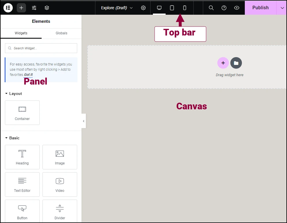
For a service business, the benefit is practical. You can give an important service its own section, put a customer story beside the right offer, and make the contact button easy to spot. You do not have to make every page follow exactly the same arrangement.
Our Dave Recommends page is one example. We used native Elementor sections to group tools by the jobs they do, with shortcuts and clear next steps. The value is helping someone find a useful recommendation, rather than showing off how many widgets we can add.
What to watch: Visual editing does not make design decisions for you. It is easy to spend an hour moving a button while leaving the main message unclear. Decide what the visitor needs before choosing the layout.
Reusable layouts: make the whole site feel connected
A business website should not feel like ten unrelated pages. Elementor’s Pro tools include Theme Builder, which lets you design shared parts such as headers, footers, and post layouts.
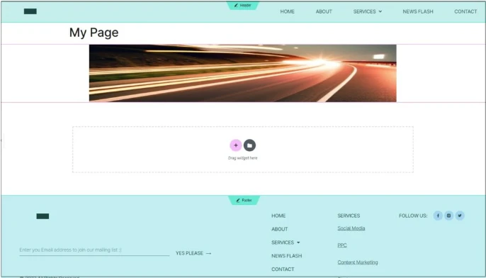
That is useful here at Authority One. Our articles use a shared layout while their writing stays separately editable. A new review can inherit the journal’s presentation without rebuilding the whole page around it.
For a small business owner, this means less repeated work. A consistent heading style, navigation, and contact area help visitors know where they are and what to do next.
What to watch: A shared change can affect many pages. That is the benefit and the risk. Know whether you are editing one page or a site-wide part, and check several pages afterward. Moving away from a builder later can also mean rebuilding its layouts; the design is part of your long-term platform choice.
Mobile controls: the small screen deserves its own attention
Your customer may be reading between appointments on a phone. A beautiful desktop layout is only part of the job. Elementor has responsive editing controls for viewing and adjusting layouts at different screen widths.
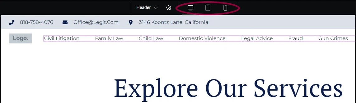

I care about the ordinary details: can someone read the heading, tap the menu, understand the offer, and reach the contact page without wrestling with the screen? The controls give us room to fix those things.
What to watch: Settings can carry from wider views into narrower ones. Check spacing, line breaks, image sizes, and buttons. Then test the published site on a real phone. A preview is a helpful working view, not a certificate that everything works.
Forms and follow-up: the page is the beginning
Elementor Pro offers a form builder, and eligible plans include other tools such as popups. Those can give a visitor a way to contact you or ask for a resource. Check the exact plan’s features before buying.
The next question is what happens after the person clicks Send. Who gets the message? Does a promised email arrive? Is the request recorded? A form that looks finished can still have an unfinished business process behind it.
On our site, Elementor handles page presentation while other tools handle specific jobs. We use Fluent Forms and FluentCRM for parts of the resource signup and follow-up system. I would rather use a clear, tested setup than replace it just because another form widget is available.
What to watch: Compare the complete journey, including email delivery and any integration you need. Page design, sending email, and managing contacts are related jobs with different requirements.
For geeks and techies: optional AI help
There are two interesting directions here. Elementor has its own AI tools for tasks such as working with text, images, code, and layouts. It also documents an MCP connection for compatible outside AI tools, including Claude, Cursor, and Codex.
MCP is a way for an AI tool to work with another application. Elementor’s connection can help an agent work with native page elements and styling, rather than handing you a pile of code to paste into a page. Its current documentation centers on the V4 Atomic editor; check version and feature compatibility for your site. Pro elements still require the appropriate plan.
I like the possibility of describing the result you want, then reviewing a real, editable layout. That could make useful work easier to get started. I am not claiming that I have tested every one of Elementor’s AI features or that any AI can connect without setup.
What to watch: AI still needs direction and review. It can misunderstand an offer or change more than you intended. Check the writing, layout, phone view, and links before publishing. Built-in AI services and your outside AI account can have separate costs or usage limits.
The good, the bad, and the ugly
The good: control that serves the business
I can shape a page around its message, keep a consistent look across the site, and make the design editable within WordPress. That is why Elementor earns its place in my toolkit. It is especially useful when a service business needs more than a basic text page.
The bad: there is a learning curve
There are many controls, and newer and older editor interfaces can look different. Layout, spacing, shared styles, and mobile settings take time to understand. A business owner who only wants to change opening hours should not have to become a page-builder expert. Set up a clear editing process and get help with the broader design.
The ugly: too much freedom can make a messy website
Extra effects, oversized images, and a stack of add-ons can make a site harder to use and maintain. A global edit can also have a bigger reach than you expect. Those are choices and ownership issues, not a claim that every Elementor site has those problems.
We have separate image and performance work on our own site. Buying a builder does not remove that work. I would measure the finished pages and keep only the features that help a visitor.
What Elementor costs—and what to compare
The official US pricing page showed these annual charges on October 5, 2026. The monthly figures on that page are annual-price equivalents, not monthly billing:
| Plan | Sites | Annual amount shown |
|---|---|---|
| Essential | 1 | $60 |
| Advanced Solo | 1 | $84 |
| Advanced | 3 | $108 |
| One | 1 | $180 promotional; $228 renewal |
Essential excludes popups, custom code/CSS, and ecommerce features. Advanced Solo includes those. One adds connected services with a shared monthly credit allowance. Check current inclusions, renewal terms, and taxes before buying.
There is also a free Elementor plugin. Start by listing the actual features you need. Budget separately for hosting, a domain, and any setup or care help. Compare a bundle with the services you already have so you do not pay twice for the same job.
Who I recommend it to
Elementor is a strong option for a service business that wants a flexible WordPress design and has a thoughtful builder or the time to learn. I particularly like it when the site needs several useful page layouts and a consistent presentation.
If your needs are a few simple pages and straightforward writing, first consider the WordPress block editor. It may cover the job without another builder. If you want a fully hosted platform with less WordPress upkeep, compare that ownership model too. This review does not claim a firsthand ranking of every alternative.
Before committing, try one real service page: your offer, a useful photo, a reason to trust you, and an obvious contact step. Check the phone view. Ask yourself whether you or your website person can confidently update it. That tells you more than a long list of features.
For my work, Elementor gives me useful room to turn a business’s message into a website that feels like theirs. That is the reason I recommend it.
