
 Good work.


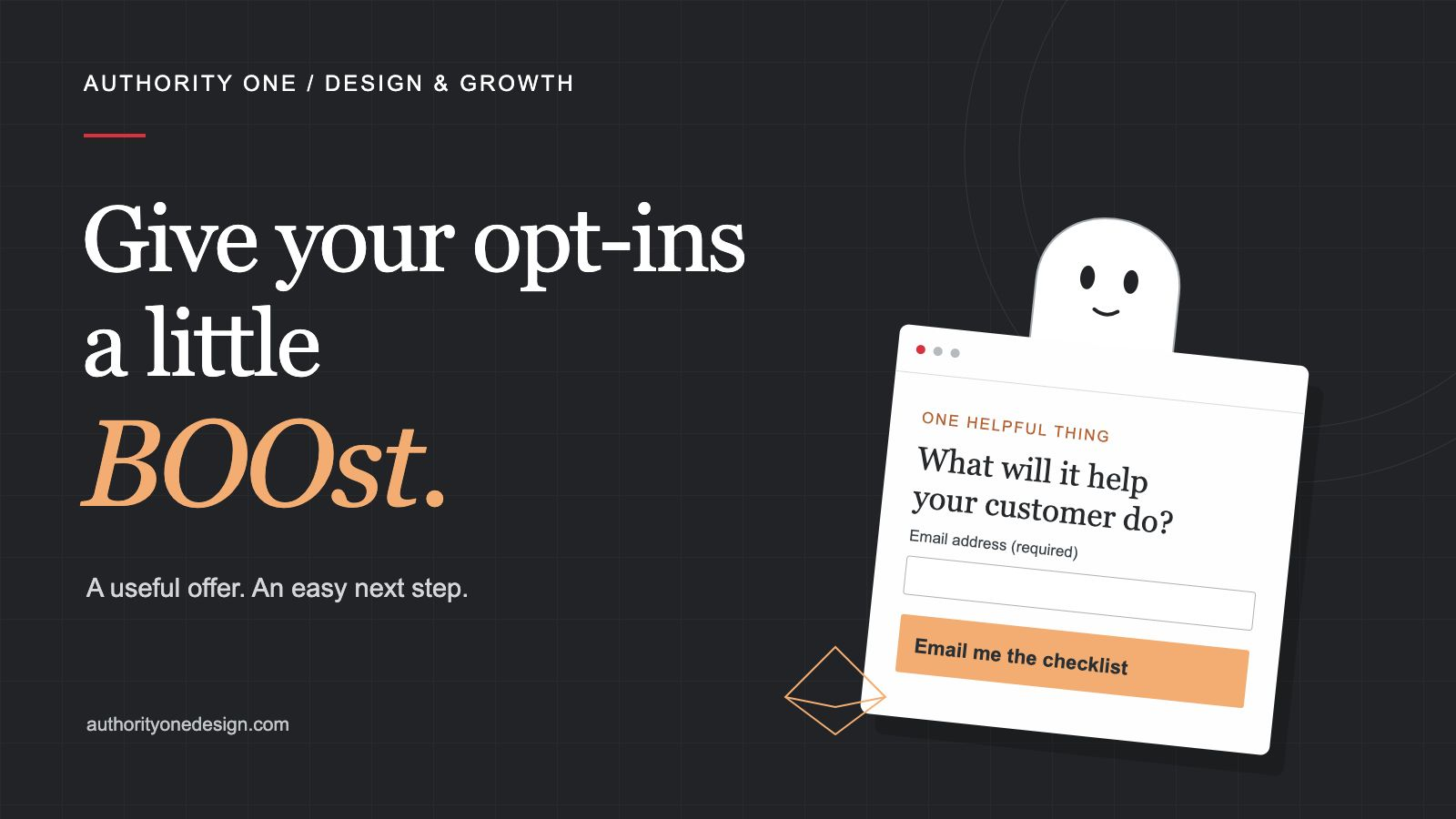
Happy Halloween from the team at Authority One Design! Before you raid the candy bowl, here’s a little treat for your marketing.
You’ve made a free guide. Put it on your website. Added a signup form. And now… crickets.
Fine for a haunted house. Less exciting when you’re hoping to start a few business conversations.
If that sounds familiar, I’d take a look at what you’re asking someone to sign up for. An opt-in is simply a signup, often in exchange for something useful, like a checklist or guide. The visitor gets some help. You get permission to start the kind of email conversation you’ve described.
But “free” doesn’t explain why they should want it. Before changing the button color or building another download, I’d ask a smaller question: does this offer help the right person do something they already care about?
The treat has to be worth the knock.
“Join our mailing list” tells me what you want. It doesn’t give me much reason to want it, too.
That doesn’t mean a newsletter can’t be useful. It means I’d explain the help inside it. What will I learn? What decision will be easier? What will I be able to check or do?
For a landscaping business, I’d start with a homeowner who’s comparing quotes and wondering why the prices are so different. A general lawn-care ebook could be interesting. A quote-comparison checklist gives that person help with the decision in front of them.
Here’s a direction I’d try for that invitation.
Download our free landscaping guide
Tips, ideas and information from our team.
Compare landscaping quotes without guessing what’s missing.
Use a one-page checklist to compare the work, materials, cleanup and terms before you choose.
Suggested offer and signup copy. These illustrations don’t collect information.
The useful change is the promise. Someone can picture what they’ll use the checklist for. The button names what they’re asking to receive. The email line should match the follow-up you actually plan to send.
I’d build the checklist around that promise, too. Ask what work is included, which materials are specified, who handles preparation and cleanup, what the schedule depends on, how payments work and what happens if the scope changes. Give people room to compare the answers side by side.
Now the free thing has a job. It helps someone prepare for a real conversation about the work.
Give the free thing a smaller job.
You don’t need to put everything you know into one download. A complete guide to everything can become a very large thing someone plans to read someday.
I’d rather give them one useful thing they can finish.
A bookkeeper could offer a year-end records checklist, organized by the documents a business owner needs to gather. A cleaning company could offer a room-by-room comparison sheet so an office manager can see what’s included in each cleaning proposal.
The offer should fit the service you want to be known for. A download can get plenty of attention and still attract people who have little reason to hire you.
Think about the question someone asks before they’re ready to buy. Help with that question.
Put the invitation where it makes sense.
Our landscaping checklist belongs beside advice about comparing landscaping quotes. The reader is already thinking about that decision. The invitation continues the conversation.
If it’s hidden in a footer under “Resources,” they have to do more work to discover why it matters.
I’d add a short invitation beside the relevant article or service information, with a clear preview of what’s inside. Show a readable sample, a few of the questions or the actual worksheet. Give someone enough to judge whether it will help.
Keep the direct inquiry path easy to find, too. Someone who’s ready to ask about your services shouldn’t have to download a guide first.
A download shouldn’t feel like a job application.
Look at every required field and ask what it’s doing there.
Do you need a phone number to send a checklist? Does the person need to tell you their project budget before reading it? Those questions might belong in an estimate request. They may be more than you need for this first step.
Keep the fields you need to deliver the offer and handle the signup properly. Label them clearly, and make it obvious which ones are required.
There isn’t one magic field count for every offer. An email checklist and a personalized assessment ask for different things. The effort should make sense for the help someone is requesting.
Tell them what happens after the click.
Will the file open on the next page? Will it arrive by email? Do they need to confirm their address first? Say so near the form.
Also explain whether more emails will follow and what they’ll be about. “Send me the checklist” shouldn’t quietly become a completely different conversation.
After signup, give them a useful confirmation. “Check your inbox for the quote checklist” is more helpful than leaving the same form sitting there with no clear sign that anything happened.
Then make the first email easy to use. Name the thing they requested. Put the access link where they can find it. Save the long company introduction for another time.
Try the whole thing on your own phone.
Start at the page where a visitor would find the offer. Use an address you control and walk through the actual signup.
- Can you read the offer and see what’s included?
- Can you complete the form without fighting the keyboard or a popup?
- If you make a mistake, does the page explain how to fix it?
- Does the confirmation tell you what to do next?
- Does the email arrive, and does its link open the right resource?
A “thank you” message on the screen doesn’t prove the email arrived. Follow it all the way through. If something goes wrong, write down the exact step so you can fix the right part.
The W3C’s accessible forms guidance is useful here: clear labels, necessary questions and helpful feedback make forms easier to use.
Give yourself something useful to learn.
Keep a simple note of how many people reach the offer page, how many complete a real signup and what happens afterward. Keep your own tests, spam and duplicates separate.
If very few people have seen the offer, a quiet few days won’t tell you much about the wording. First check whether relevant people are reaching it.
And don’t judge the whole thing by list size. Are the right people joining? Are they using what you send? Does the follow-up lead to questions or useful conversations?
Pick one change with a clear reason behind it, like a more specific offer headline. Give it a chance to be seen before changing everything again. With a small audience, you’re gathering clues, not declaring a winning formula.
One useful BOOst to start with.
Choose one free offer. Read the invitation out loud. Then finish this sentence: “This will help you ______.”
If the answer is hard to explain, start there. Make the promise more specific, make sure the resource delivers it and walk through the signup yourself.
For a fuller walkthrough, my free guide Create a Free Offer People Want covers choosing the problem, shaping the offer and planning a useful follow-up.
And if you’d like help bringing the words, design and next steps together on your own website, you can start with a free homepage preview.
The Halloween decorations can come down next week. A good reason to sign up should still be there.
